
Our Technique: The Radical Art of Restraint
How and why of what we do
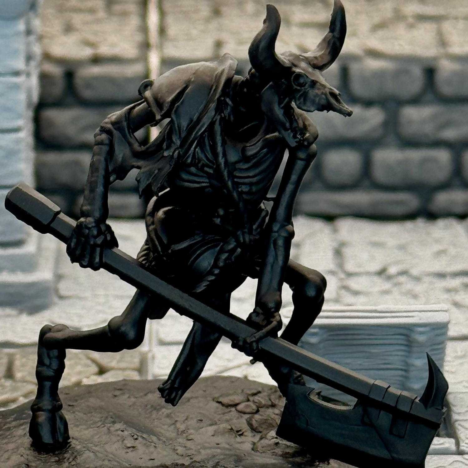
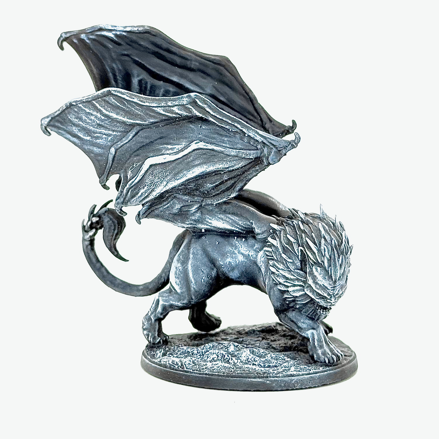
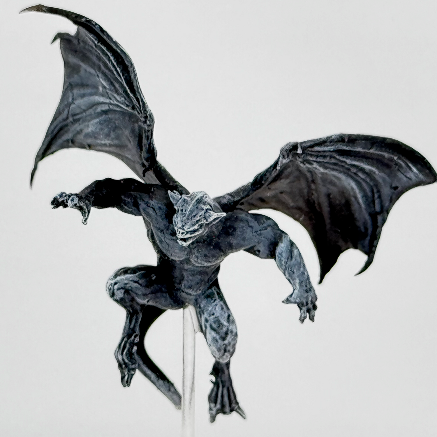
While others perfect their rainbow techniques and master forty-seven different metallic finishes (seriously, the skill out there is insane), we've become obsessed with something much simpler: making three colors do the work of seventeen.
Black primer base. Careful grey and white drybrushing. That's it. No complex color theory, no fifteen-step processes, no techniques that require a degree in art history to appreciate.
The result? Miniatures that look like they wandered out of a classic gaming manual. Figures that complement your story instead of competing with it.

The Process: How We Actually Do It
Our three "color" approach is straightforward, but there's method behind the simplicity. Here's exactly how we recreate that pen-and-ink aesthetic in miniature form.

Step 1
Black Primer Foundation
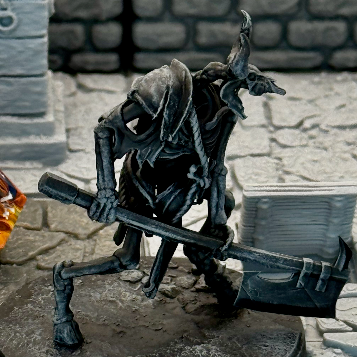
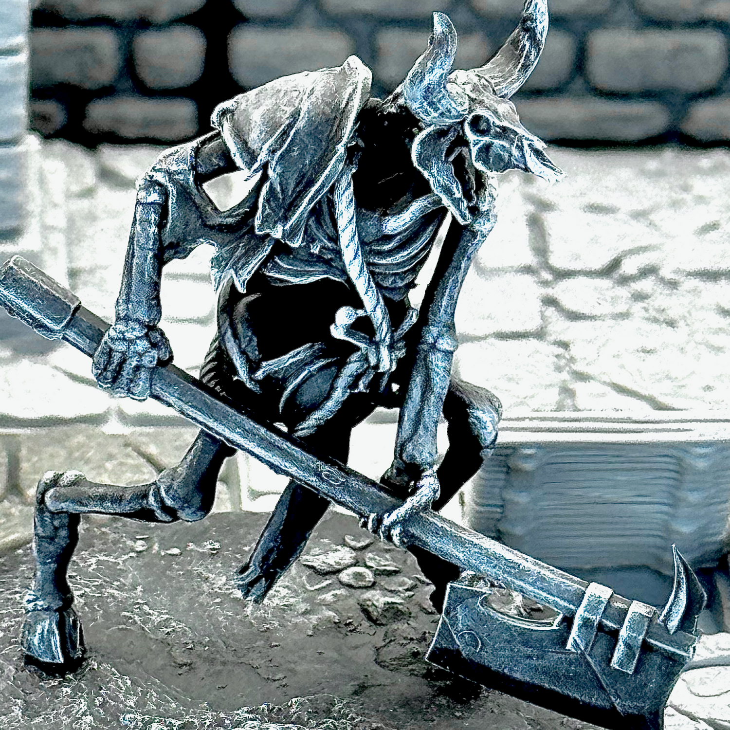
We start with black primer, but it's not a base coat for other colors—it stays black. This becomes your deepest shadows, recessed areas, and line definition. In pen-and-ink illustrations, the black ink defines form and creates contrast. Same principle here.
Step 2:
Grey Mid-Tones
Using a dry brush technique, we apply grey to the raised surfaces and mid-level details. This isn't full coverage—we're selectively building up areas where light would naturally hit or where we want to define form. The grey creates the transition between the black shadows and white highlights.
Step 3:
White Highlights
White goes on the most prominent edges and surfaces. Weapon edges, armor ridges, facial features, fabric folds. These are deliberate accent points, not attempts at realistic lighting. We place them where they'll have the most visual impact, just like an illustrator would.
Why We Skip Color
Most miniature painting focuses on realistic color schemes and natural lighting. We're not trying to replicate reality—we're trying to replicate the look of black and white illustrations. Those illustrations work because they use contrast and selective highlighting, not because they show everything in full color.
Practical Advantages
- Works under any lighting conditions at your gaming table
- Reads clearly from normal viewing distance during play
- Creates consistent visual style across different figures
- Faster to complete than complex color schemes
- Matches the aesthetic of classic gaming art